Heroes United

The Problem
As as team of five, we wanted to challenge ourselves by making a game.
The Process
After settling on some basic features such as user accounts, character select, chapter select, attack locations on the enemy, we split up to work on the different parts. One person tackled setting up the database to store the user data as well as character data that would persist as the user progressed through the chapters. One person worked on the look of the interface as well as the character select screen and chapter select screen. One person was tasked with figuring out the game logic that would run the battles. One person worked on user logins, and I worked on the character encounters. Communication was key as we constantly needed to run ideas by other team members as our tasks overlapped.
The Product
The flow of the game is like so: If you're a new user, create an account, otherwise log into your account. Choose a character, then distribute your points. You're then taken to the chapter select page where you can choose a new character if you didn't like your original choice, or choose to set out on your adventure. Each chapter on your adventure must be completed before the next one unlocks, and in each chapter you are met with an enemy to defeat. Failure to do so will end in loss and take you back to the chapter select screen to try again. Success will also take you back to the chapter select, but you will find the next chapter unlocked for you. Once the final boss has been defeated, you win the game, and are the hero of the kingdom.
My Role
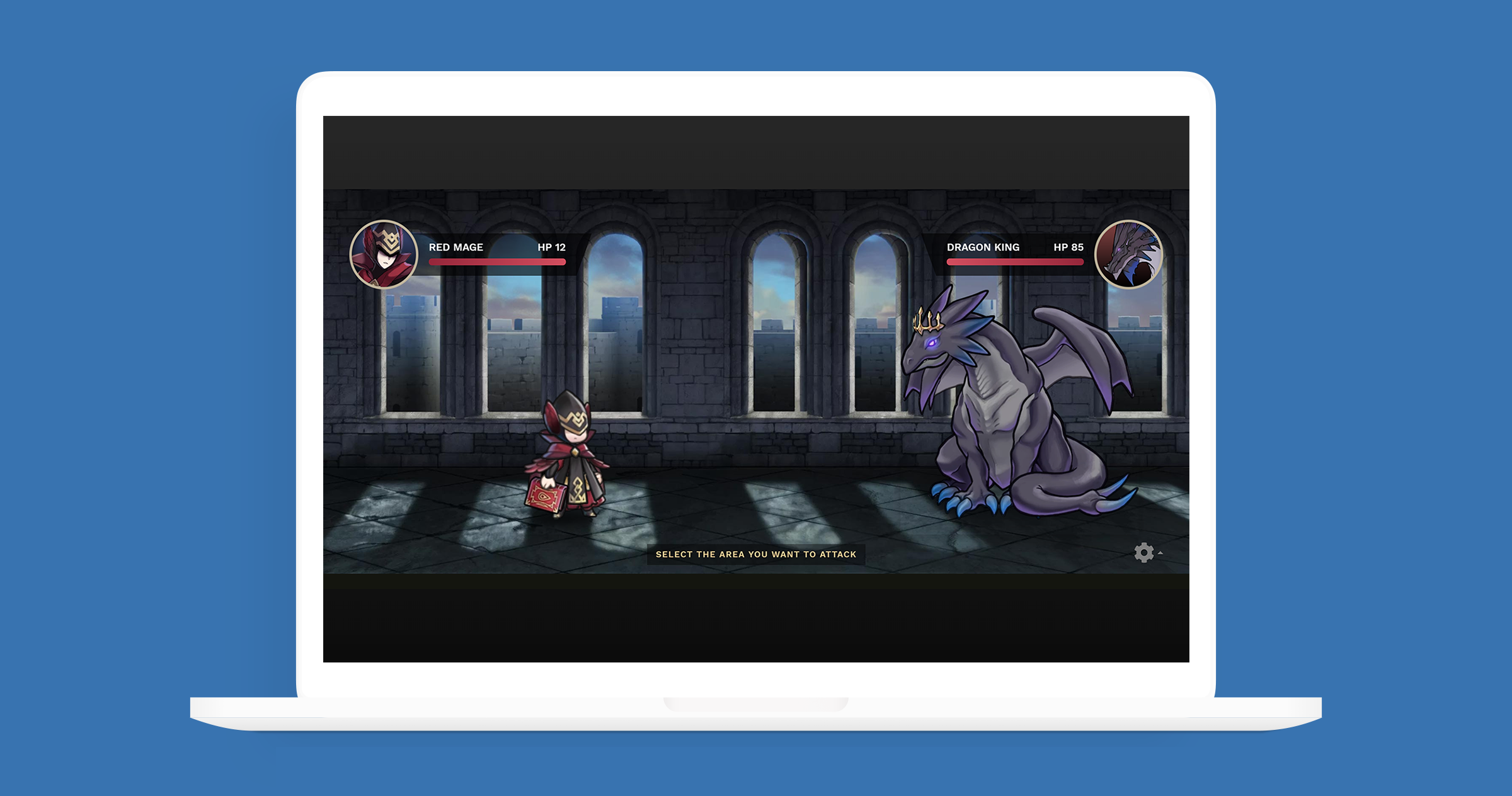
I focused on the character encounters page, basically the actual battle for each chapter. I worked closely with my teammate that was doing the game logic, as her logic would be the bones that my assets were going to sit on top of. No one on the team was an artist, and we only had about nine days to complete the project, so we opted to use pre-made assets so we could focus on the mechanics of the game.
One of the ideas we came up with to enhance the player experience by giving them some choice, was to allow players to choose a location on the enemy's body to attack. To achieve this, I created individual paths for each attackable body part in Adobe Illustrator, and exported them out as SVG so we could manipulate them on the page. For visual feedback, I colored each body part a transparent red when hovered over, and included a sliding pop-up to give details on how each body part differed from the others.
Animations were another area where we felt it was important to give players some feedback to further enhance their experience. I created a graphic for damage values to appear on screen after each character attacks, so you not only know how much damage you gave or received, but you also felt like your attack meant something. To add to that, I also shook or slid the characters depending on whether they took damage or missed an attack, as well as sliding them toward their opponent during the initial thrust. These additions gave the game a sense of life and energy, and I feel they really made it a more dynamic game as opposed to static experience.