AtlasQuest Reimagining
Preface
What is Letterboxing? Letterboxing is like a global scavenger hunt. Everyone has their own stamp and logbook, and there are boxes hidden all over with stamps inside. Websites like AtlasQuest provide a searchable database of box locations that one can use to find boxes nearby. Boxes are usually hidden outside, off the beaten path along trails; though some are hidden in urban area or even indoors. When you find a box, you stamp your stamp in the found logbook, and stamp the found stamp in your logbook. AtlasQuest offers the ability to keep track of all your found boxes, along with many other social features.
The Problem
AtlasQuest is a fantastic tool for Letterboxers! It has forums, chatrooms, lists, sorting, filtering; more features than the average user probably uses. The problem comes with the layout. The site uses a widget-style layout on many pages which works for how the information is organized, but it looks very cluttered and ends up with every widget fighting for your attention.
The Process
AtlasQuest has several themes to choose from, but I chose the default theme to guide my process. I started with the purple header color in the default theme, and built a color palette from there.

My goal was to make the information more digestible and less chaotic. The kitchen sink approach of having all options available at once is convenient if you know what you need and what you can ignore, but it can also be daunting to new users.
The Product
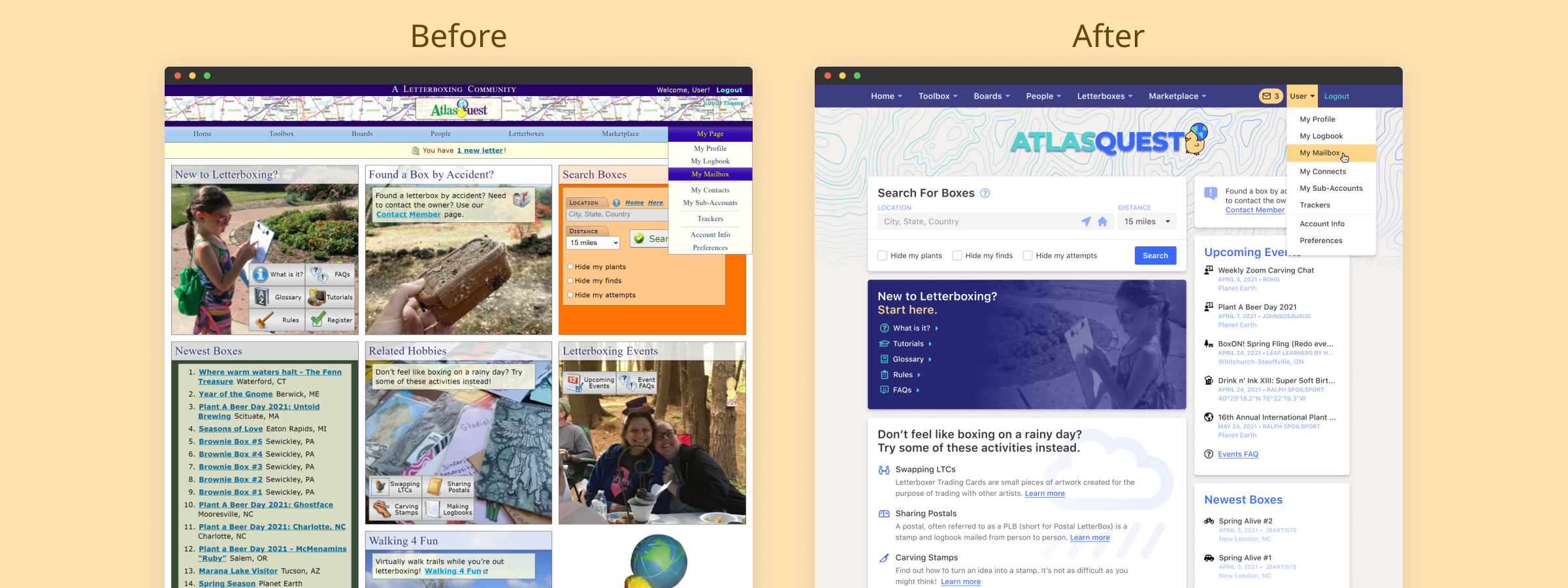
Note: You can view full-size previews of the project above.For starters I moved the navigation up to be with the Register/Login section. There is a write-up explaining the default theme and it talks about the creator wanting to use a map in some way. Maps are awesome, but the selected one looks very busy. I chose a topographic design, lightened it, added a gradient for interest, and placed it behind the (new) logo. I also had the map fade out behind the content to draw your eye down and incorporate it into the rest of the design. The map also picks back up at the bottom where the footer begins.
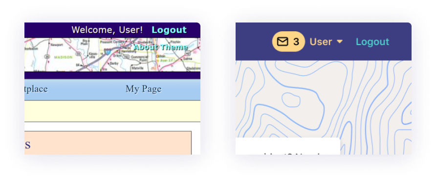
Most users probably use the My Page section most frequently. I removed that section from the main nav and incorporated it into the User section next to the Logout button. Most websites that have user accounts have that accessible in the upper-right, so that's where I placed it here. Clicking your username will take you to the My Page page, and hovering over your username will give you the same dropdown as before. I also added a mail notification to alert you to any new messages you've received.
The rest of the content on the Home Page is made up of seven boxes, similar to widgets on other pages. There's a lot going on, and a lot of room for tidying up. The 3-column layout gives no clear indication of immediacy or importance to any of the boxes on the page, so I decided to go with a more common 2-column layout and choose a few elements to act like main content and use the others as sidebar content.
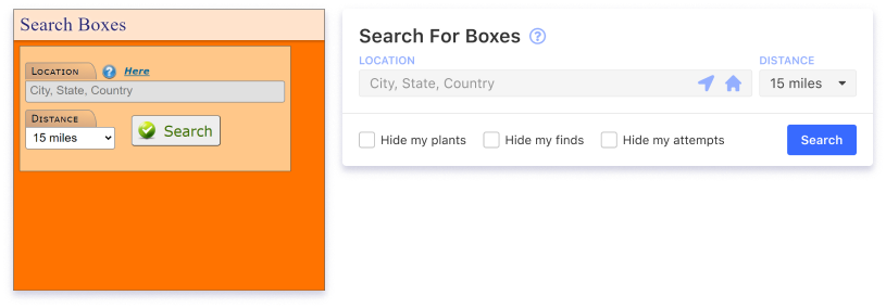
The Letterbox Search component is the next most-useful element on the page after the My Page link, so I chose it to be at the top. Some simple clean-up here: I placed the Get Current Location button and the Home Location button inside the search bar for convenience. I added filter checkboxes for the common filters used on many of the searches across the site.
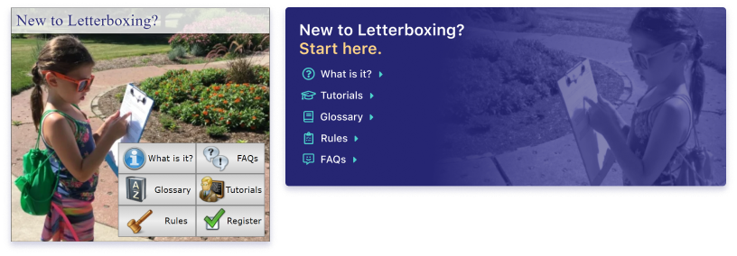
A lot of the boxes were beginning to look samey and blend together, so I added a splash of color to the New To Letterboxing component to help it stand out to newcomers and add some flair to the design.
I used a combination of Font Awesome icons and Streamline icons, sometimes modifying them to better fit my needs. AtlasQuest has a very quirky, "crafty" feel to it, especially with the icons it uses. If this were a full-blown project, I would create a custom icon set that tried to find a good balance between quirkiness and clean & simple design. For instance, I just used a default knife to indicate hand-carved stamps, where an icon for a Linoleum Cutter would be more applicable.
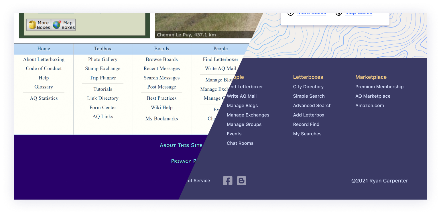
The original footer contained a list of all the links in the nav bar at the top, along with some standard fare footer links. I like footers that aggregate a lot of links in one place like that; it feels like an index like you would find at the back of the book. Using the orange accent color on the column headers and placing everything in the footer on a muted purple background helps bring it together and makes it feel properly contained. Flat icons for the social links helps them to fade into the flow of information while still remaining visible.
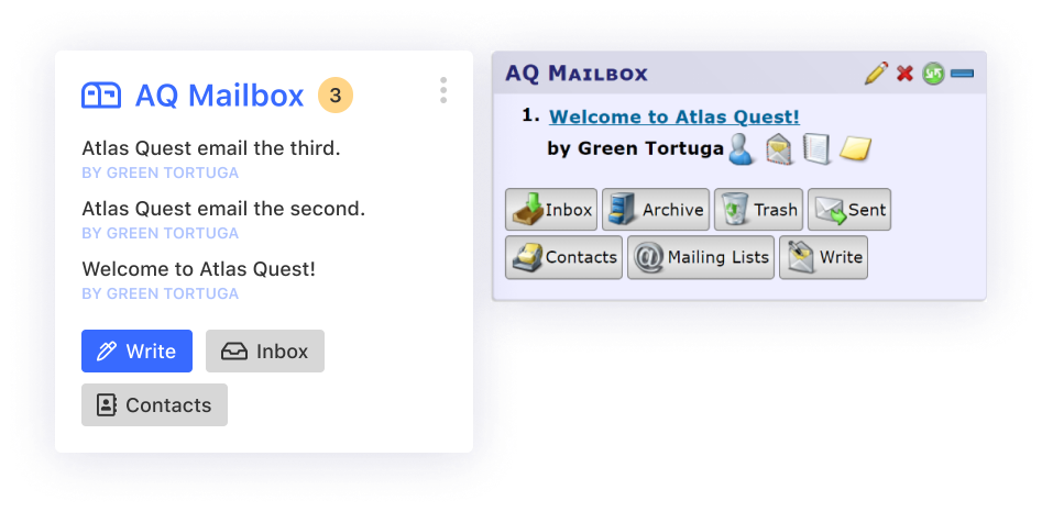
For the "My Page" page it made sense to keep the widget layout, as each widget component was a quick glance at a little bit of data that a user would be interested in seeing. The Mailbox component is a good example of the kitchen sink approach needing to be reigned in. Each message you receive is listed with four icons giving you options to view the sender's profile, message them, view their logbook, or add a note. I don't think those options get used all that often, and could be moved to the Mailbox page itself to clean up the UI a bit. The same goes for the plethora of links at the bottom. I kept the ones that seemed like they would be used most, and pushed the others to the Mailbox page itself.
It should be noted that each widget component has an options menu at the top that will allow some customization or offer specific options to manage that component. The round green icon at the top of the original widget allows a user to click it and refresh the component to get updated data. Depending on the database used, this could listen for updates in the database and automatically refresh the component with new data.
The rest of the components on the page follow a similar idea: show the most recent information, while giving the ability to click through to see more. My goal was to tidy up the information and display it in a way that would allow you to quickly scan and find what you need. Another great feature AtlasQuest offers is the ability to drag and drop widgets to reorganize the flow of the columns, so whatever you use the most can be moved up to the top.
The Wrap-up
I had a blast doing this project. I really like what I was able to achieve. AtlasQuest has great bones, but it has an older, early Web 2.0 look to it that is in need of an update. My reimagining takes into account contemporary design trends and updates the look and feel of the site without straying too far from what its users have become so familiar with.